循序渐进BootstrapVue,开发公司门户网站(4)--- 使用b-carousel-slide组件实现图片轮播以及vue-awesome-swiper实现图片滑动展示
在BootstrapVue组件库里面,提供了很多对Bootstrap同等类似的组件封装,其中图片轮播可以采用b-carousel-slide组件实现,而有一些小的图片,如客户/合作伙伴Logo或者友情连接什么的,则可以使用一个滑动图片展示的vue-awesome-swiper组件。本篇随笔综合介绍使用b-carousel-slide组件实现图片轮播以及vue-awesome-swiper实现图片滑动展示。
1、使用b-carousel-slide组件实现图片轮播
轮播不会自动标准化幻灯片尺寸。 因此,您可能需要使用其他实用程序或自定义样式来适当调整内容的大小。 在每张幻灯片中使用图像时,请确保它们均具有相同的尺寸(或长宽比)。
轮播默认间隔为
5000
毫秒(5秒)。您可以通过将
interval
属性设置为所需的毫秒数来更改幻灯片之间的间隔。 支持的最小滑动间隔为1000毫秒(1秒)。
设置属性
controls
以启用前一个和后一个控件按钮。设置属性
indicators
以显示滑动指示器按钮。指示器和控件都可以同时设置或独立设置。
属性
caption
: 用作幻灯片上主要标题的文本(放置在具有
carousel-caption
类的内部元素内)text
: 标题下的文本(放置在具有
carousel-caption
类的内部元素内)img-src
: 要放在幻灯片背景中的图像的URLcaption-html
:
caption
属性的 Alternate 属性,它支持HTML字符串html
:
text
属性的 Alternate 属性,它支持HTML字符串
命名插槽
default
将放置在具有
carousel-caption
类的内部元素内部的内容。 出现在
caption
和
text
属性的任何内容之后。img
放置在幻灯片背景中的内容。 尽管有插槽的名称,但您几乎可以将任何内容放置在该插槽中,而不必使用
default
(默认)的插槽
caption
和
text
属性。
下面是b-carousel-slide轮播组件的一个使用代码:
<div>
  <b-carouselid="carousel-fade"style="text-shadow: 0px 0px 2px #000"fade

    indicators

    img-width="1024"img-height="480"
  >
    <b-carousel-slidecaption="First slide"img-src="https://picsum.photos/1024/480/?image=10"
    ></b-carousel-slide>
    <b-carousel-slidecaption="Second Slide"img-src="https://picsum.photos/1024/480/?image=12"
    ></b-carousel-slide>
    <b-carousel-slidecaption="Third Slide"img-src="https://picsum.photos/1024/480/?image=22"
    ></b-carousel-slide>
  </b-carousel>
</div>
或者用命名插槽的方式,演示代码如下所示
 <b-carouselv-model="slide":interval="5000"controls fade indicators background="#ababab"style="text-shadow: 1px 1px 2px #333; background: #ccc"
@sliding-start="onSlideStart"@sliding-end="onSlideEnd">
    <b-carousel-slide>
      <templatev-slot:img>
        <b-imgfluid

          :src="size=='big' ? require('@/../static/site2/img/banner/banner01_big.jpg') : require('@/../static/site2/img/banner/banner01_small.jpg')"alt="banner"
        />
      </template>
    </b-carousel-slide>
  </b-carousel>
</template>
由于我们使用Vue,一般来说,轮播的图片是动态增加的,而不是固定的连接,因此用变量代替,遍历展示即可,模板代码如下代码。
  <b-carouselv-model="slide":interval="5000"controls fade indicators background="#ababab"
style="text-shadow: 1px 1px 2px #333; background: #ccc"@sliding-start="onSlideStart"@sliding-end="onSlideEnd">
    <b-carousel-slidev-for="(item, index) of carousel_list":key="index">
      <templatev-slot:img>
        <divstyle="position: relative">
          <b-imgfluid :src="size=='big' ? item.bigImage : item.smallImage"alt="banner" />
          <divclass="mask":class="{mask2: (index+1)%2==0}">
            <divclass="content":class="{content2: (index+1)%2==0}">
              <h3class="title mb-3 wow fadeInLeft"data-wow-delay="0.2s">{{ item.title }}</h3>
              <divclass="desc wow mb-3 fadeInRight"data-wow-delay="0.2s"v-html="item.desc" />
              <divclass="line wow fadeInUp"data-wow-delay="0.6s"v-html="item.subdesc" />
            </div>
          </div>
        </div>
      </template>
    </b-carousel-slide>
  </b-carousel>
其中wow fadeInLeft 这些用了WOW的动态效果,而 {mask2: (index+1)%2==0} 的判断,用于左右显示文本的不同。
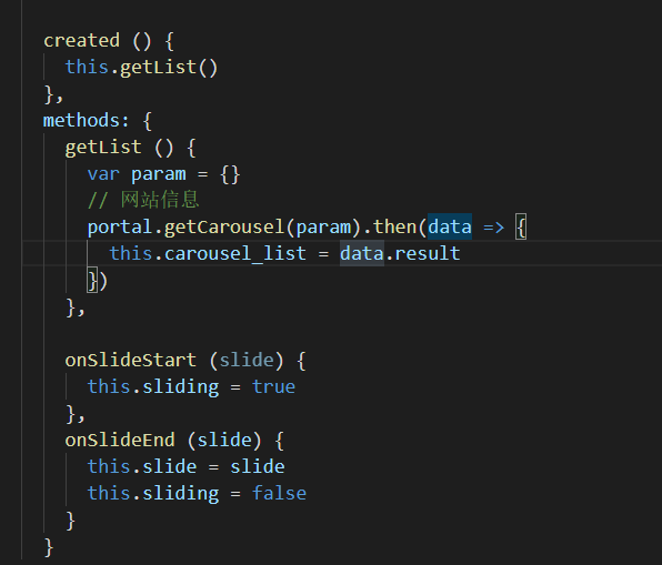
其中Vue部分的JS代码如下所示,定义了变量和所需的数据列表。
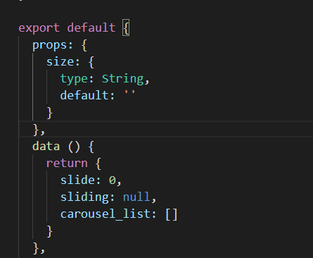
而轮播所需的carousel_list的集合数据,我们动态从接口获取即可。
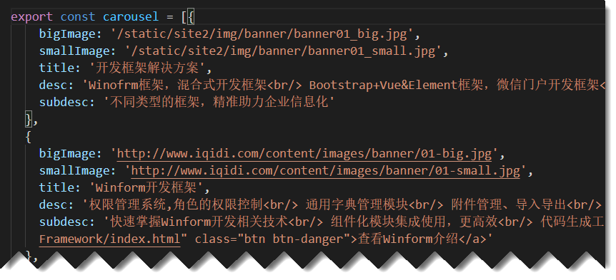
而轮播列表的内容,我们可以模拟数据,或者从后端获取真实的数据,数据结构大概如下所示。
这样我们运行的时候 ,效果如下所示。


不同的轮播,我们指定不同的背景图片,以及文字,就很好的达到展示产品信息的目的。
一般轮播图片,我们是放在布局Layout页面里面的,因此需要在Layout页面定义的时候,引入对应的自定义封装的轮播组件即可。
<template>
  <div>
    <my-header/>
    <carouselclass="d-none d-md-block d-lg-block d-xl-block"style="height: 0; padding-bottom: 31.2%"size="big" />
    <carouselclass="d-block d-md-none d-lg-none d-xl-none"style="height: 0; padding-bottom: 120%"size="small" />
    <router-view:key="key" />
    <my-footer/>

    <divv-show="show_backtop"class="backtop"@click="backTop"><iclass="el-icon-arrow-up" /></div>
  </div>
</template>

<script>import MyHeader from'./components/Header'import MyFooter from'./components/Footer'import Carousel from'./components/Carousel'exportdefault{

  components: {

    MyHeader,

    MyFooter,

    Carousel

  },
其中这里使用了两个轮播元素定义,是基于响应式框架布局考虑,d-none d-md-block d-lg-block d-xl-block 是在md/lg/xl的时候显示的,d-block d-md-none d-lg-none d-xl-none 则是在sm的情况下显示的,也就是md/lg/xl的时候不显示的意思。
如需详细了解,可以参考
https://code.z01.com/v4/utilities/display.html
Display显示属性的说明。
2、使用vue-awesome-swiper实现图片滑动展示
前面开头的地方说了,有一些小的图片,如客户/合作伙伴Logo或者友情连接什么的,我们可能希望以图片的方式展示一个图片墙即可,如果内容比较多,那么占用版面比较大,而采用 vue-awesome-swiper 则可以避免这个问题,它是在展示图片的基础上,定时动态移动图片浏览,可以在更小的空间上放置更多的图片。
vue-awesome-swiper 的使用有很多,不过不太建议用比较新的版本,有时候可能出现一些使用异常,比较难以处理,因此我采用比较稳定的低版本来展示图片。

我们来看看具体的展示效果,其中单击图片,可以打开合作伙伴的网站地址。

这个面板在可视范围内,展示固定的几张图片,然后动态滑动,可以放置很多,又能拖动查看,效果还是非常不错的。
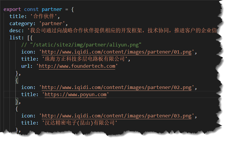
这个合作伙伴的数据结构如下所示。
那么vue-awesome-swiper它的使用是如何的呢。
先通过npm进行安装组件指定版本
npm install vue-awesome-swiper@3 --save-dev
在Vue的项目中的main.js中全局增加对控件的加载。
import Vue from 'vue'import'swiper/dist/css/swiper.css'import VueAwesomeSwiper from 'vue-awesome-swiper/dist/ssr'Vue.use(VueAwesomeSwiper)
定义一个滑动图片的组件,用于接收相关数据显示即可。
<!--可以拖动的Slide组件,需要安装vue-awesome-swiper组件-->
<template>
  <divclass="wrap">
    <divclass="mt-4 d-none d-lg-block d-xl-block">
      <divv-swiper:mySwiper1="swiperOptions">
        <divclass="swiper-wrapper">
          <divv-for="(item, index) of list":key="index"class="swiper-slide">
            <divclass="img-wrap mx-3 p-4">
              <b-img:src="item.icon"fluid :alt="item.title"@click="open(item.url)" />
            </div>
          </div>
        </div>
      </div>
    </div>

    <divclass="mt-4 d-block d-lg-none d-xl-none">
      <divv-swiper:mySwiper2="swiperOptions2">
        <divclass="swiper-wrapper">
          <divv-for="(item, index) of list":key="index"class="swiper-slide">
            <divclass="img-wrap mx-3 p-4">
              <b-img:src="item.icon"fluid :alt="item.title"@click="open(item.url)" />
            </div>
          </div>
        </div>
      </div>
    </div>
  </div>
</template>
这里用了两个声明,也是基于布局不同的显示的,和前面轮播的处理类似。
而 v-swiper 这是加载vue-awesome-swiper后注入的装饰器v-swiper.
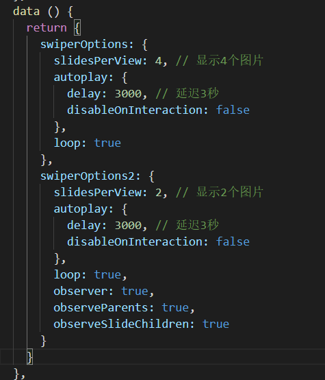
其中这个组件的配置信息如下定义。
除了这两种,有时候我们的产品可能需要展示更多的图片,就是图片画廊的意思,那么我们就可以综合展示图片了,如下效果所示。

以上就是常规图片的几种处理方式,有时候根据不同的需求,可以定义不同的界面效果来进行展示。
系列文章如下所示:
循序渐进BootstrapVue,开发公司门户网站(1)---基于Bootstrap网站模板构建组件界面
循序渐进BootstrapVue,开发公司门户网站(2)--- 使用wow.js动画组件以及自定义的CSS样式处理动态效果
循序渐进BootstrapVue,开发公司门户网站(3)--- 结合邮件发送,收集用户反馈信息
循序渐进BootstrapVue,开发公司门户网站(4)--- 使用b-carousel-slide组件实现图片轮播以及vue-awesome-swiper实现图片滑动展示