HarmonyOS NEXT 5.0自定义增强版导航栏组件|鸿蒙ArkUI自定义标题栏
这段时间比较热门的莫过于华为推出的自主研发的面向全场景分布式操作系统
HarmonyOS
。
最新一直潜心学习鸿蒙os开发,于是基于
HarmonyOS NEXT 5.0 API12 Release
开发了一款自定义多功能导航条组件。

HMNavBar组件支持
自定义返回键、标题/副标题、标题居中、背景色/背景图片/背景渐变色、标题颜色、搜索、右侧操作区
等功能。
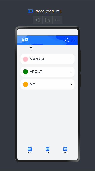
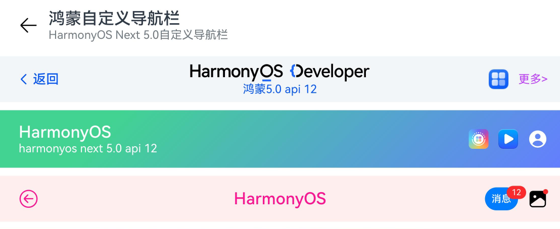
如下图:组件结构非常简单。
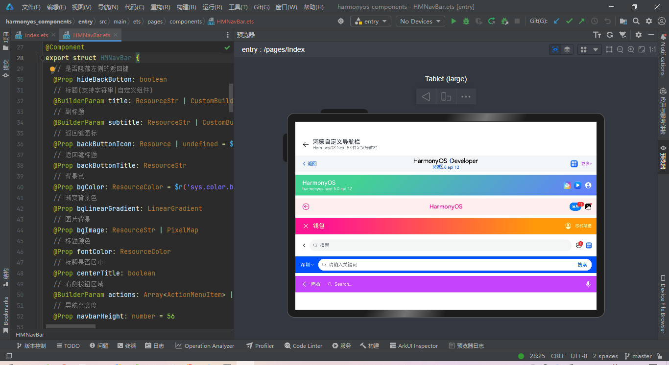
组件参数配置
@Component

export struct HMNavBar {//是否隐藏左侧的返回键
  @Prop hideBackButton: boolean
  //标题(支持字符串|自定义组件)
  @BuilderParam title: ResourceStr | CustomBuilder =BuilderFunction//副标题
  @BuilderParam subtitle: ResourceStr | CustomBuilder =BuilderFunction//返回键图标
  @Prop backButtonIcon: Resource | undefined = $r('sys.symbol.chevron_left')//返回键标题
@Prop backButtonTitle: ResourceStr//背景色
  @Prop bgColor: ResourceColor = $r('sys.color.background_primary')//渐变背景色
@Prop bgLinearGradient: LinearGradient//图片背景
  @Prop bgImage: ResourceStr |PixelMap//标题颜色
@Prop fontColor: ResourceColor//标题是否居中
  @Prop centerTitle: boolean
  //右侧按钮区域
  @BuilderParam actions: Array<ActionMenuItem> | CustomBuilder =BuilderFunction//导航条高度
  @Prop navbarHeight: number = 56

  //...
}
调用方式非常简单易上手。
- 基础用法
HMNavBar({

  backButtonIcon: $r('sys.symbol.arrow_left'),

  title:'鸿蒙自定义导航栏',

  subtitle:'HarmonyOS Next 5.0自定义导航栏',

})
- 自定义返回图标/文字、标题、背景色、右键操作按钮
@Builder customImgTitle() {

  Image('https://developer.huawei.com/allianceCmsResource/resource/HUAWEI_Developer_VUE/images/logo-developer-header.svg').height(24).objectFit(ImageFit.Contain)

}


HMNavBar({

  backButtonIcon: $r('sys.symbol.chevron_left'),

  backButtonTitle:'返回',

  title:this.customImgTitle,

  subtitle:'鸿蒙5.0 api 12',

  centerTitle:true,

  bgColor:'#f3f6f9',

  fontColor:'#0a59f7',

  actions: [

    {

      icon: $r('app.media.app_icon'),

      action: ()=> promptAction.showToast({ message: "show toast index 1"})

    },

    {//icon: $r('sys.symbol.plus'),
      label: '更多>',

      color:'#bd43ff',

      action: ()=> promptAction.showToast({ message: "show toast index 2"})

    }

  ]

})
//自定义渐变背景、背景图片、右侧操作区
HMNavBar({

  hideBackButton:true,

  title:'HarmonyOS',

  subtitle:'harmonyos next 5.0 api 12',

  bgLinearGradient: {

    angle:135,

    colors: [['#42d392 ',0.2], ['#647eff',1]]

  },//bgImage: 'pages/assets/nav_bg.png',
  //bgImage: 'https://developer.huawei.com/allianceCmsResource/resource/HUAWEI_Developer_VUE/images/1025-pc-banner.jpeg',
  fontColor: '#fff',

  actions: [

    {

      icon:'https://developer.huawei.com/allianceCmsResource/resource/HUAWEI_Developer_VUE/images/yuanfuwuicon.png',

      action: ()=> promptAction.showToast({ message: "show toast index 1"})

    },

    {

      icon:'https://developer.huawei.com/allianceCmsResource/resource/HUAWEI_Developer_VUE/images/0620logo4.png',

      action: ()=> promptAction.showToast({ message: "show toast index 2"})

    },

    {

      icon: $r('sys.symbol.person_crop_circle_fill_1'),

      action: ()=> promptAction.showToast({ message: "show toast index 3"})

    }

  ],

  navbarHeight:70})
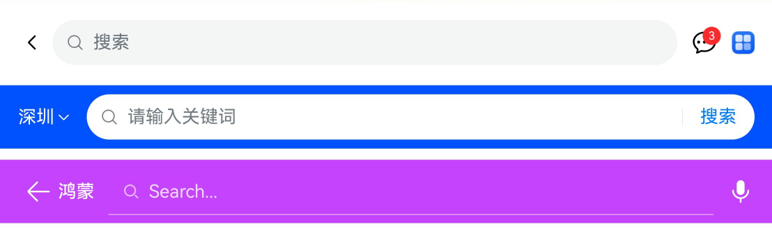
如上图:还支持自定义
导航搜索
功能。
HMNavBar({

  title:this.customSearchTitle1,

  actions:this.customSearchAction

})


HMNavBar({

  hideBackButton:true,

  title:this.customSearchTitle2,

  bgColor:'#0051ff',

})


HMNavBar({

  backButtonIcon: $r('sys.symbol.arrow_left'),

  backButtonTitle:'鸿蒙',

  title:this.customSearchTitle3,

  bgColor:'#c543fd',

  fontColor:'#fff',

  actions: [

    {

      icon: $r('sys.symbol.mic_fill'),

      action: ()=>promptAction.showToast({ ... })

    }

  ]

})
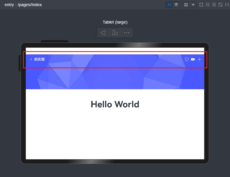
HMNavBar导航组件布局结构如下。
build() {

    Flex() {//左侧模块
Stack({ alignContent: Alignment.Start }) {

        Flex(){if(!this.hideBackButton) {this.backBuilder()

          }if(!this.centerTitle) {this.contentBuilder()

          }

        }

        .height('100%')

      }

      .height('100%')

      .layoutWeight(1)//中间模块
      if(this.centerTitle) {

        Stack() {this.contentBuilder()

        }

        .height('100%')

        .layoutWeight(1)

      }//右键操作模块
Stack({ alignContent: Alignment.End }) {this.actionBuilder()

      }

      .padding({ right:16})

      .height('100%')

      .layoutWeight(this.centerTitle ? 1 : 0)

    }

    .backgroundColor(this.bgColor)

    .linearGradient(this.bgLinearGradient)

    .backgroundImage(this.bgImage, ImageRepeat.NoRepeat).backgroundImageSize(ImageSize.FILL)

    .height(this.navbarHeight)

    .width('100%')

}
支持悬浮在背景图上面。
最后,附上几个最新研发的跨平台实例项目。
Tauri2.0+Vite5聊天室|vue3+tauri2+element-plus仿微信|tauri聊天应用
tauri2.0-admin桌面端后台系统|tauri2+vite5+element-plus管理后台EXE程序
Ok,今天的分享就到这里,希望以上的分享对大家有所帮助!
